Research Invents New Graphing Method
Diamond Graph Corrects Long-Standing Errors of 3-D Bar Graphs
Looks can be deceiving. That’s one of the problems with today’s three-dimensional bar graph. While these graphs may look correct, researchers from the Johns Hopkins Bloomberg School of Public Health believe they are in fact inaccurate and misleading.
Currently, the 3-D bar graph is used in countless computer programs, scientific journals, and newspapers to display financial, medical, and other information in which two variables lead to an outcome. Alvaro Muñoz, PhD, a professor of epidemiology at the School of Public Health, has developed the new diamond graph, which corrects these errors and represents all the variables equally in a form that is easy to read. He believes the new graphing method could replace the traditional 3-D bar graph in software commonly used in business and science. Dr. Muñoz and his colleagues described the diamond graph method in an article published in the August 2003 edition of the peer-reviewed journal, The American Statistician.
So what is wrong with the old method? According to Dr. Muñoz, the 3-D bar graph has three main flaws. First, the variables, which equally contribute to an outcome, are not equally represented in the diagram. This gives the impression that one variable is more important than another. Second, it is sometimes difficult, if not impossible, to distinguish the true value of the bars, because of the problems of representing a three-dimensional image on a two-dimensional page. Because of perspective, some bars appear to be of greater or lesser value when they are actually of equal value. The third drawback of the 3-D graph is that it cannot be used to present overlapping data. In some cases, parallel bars with higher values may obscure those with lower values making the graph useless.
“The inaccuracies of the traditional 3-D bar graph may seem trivial, but they can be significant when you’re dealing with important information like predicting your risk for a heart attack or plotting the performance of your company investments,” said Dr. Muñoz.
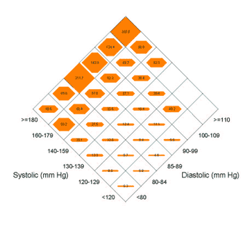
The new diamond graph method corrects the inaccuracies and limitations of the 3-D bar graph by representing all variables equally on a 2-D graph. The diamond graph is essentially the view of the bar graph from above rather than from the side. Instead of using rising parallel bars, the diamond graph uses expanding polygons within a diamond-shaped grid to represent values. The researcher experimented with other shapes, but found that the six-sided polygon was the only shape to represent the outcomes equally within the grid as it expanded.
Over the years, other researchers have attempted to develop a better graphing method, but the diamond graph is the first to equally represent the relationships between a continuous outcome and each of the two categorical predictors in a single plot.
“We call our new method of display the diamond graph. It has the shape, and hopefully, the value of a diamond. Perhaps more importantly, it is reminiscent of the baseball diamond that The American Statistician equiponderantly loves. Who would have thought we would still be inventing new methods of graphing in the twenty-first century?”
Johns Hopkins University is seeking partners who would like to incorporate the diamond graph method into their commercial software. JHU has a patent pending. Inquiries may be directed to Deborah Alper at Johns Hopkins Bloomberg School of Public Health at dalper@jhsph.edu or 443-287-0402.
“A Diamond-Shaped Equiponderant Graphical Display of the Effects of Two Categorical Predictors on Continuous Outcomes” was written by Xiuhong Li, Jennifer M. Buechner, Patrick M. Tarwater and Alvaro Muñoz.
The research was sponsored by grants from the National Institute of Allergy and Infectious Diseases.
Public Affairs Media Contacts for the Johns Hopkins Bloomberg School of Public Health: Tim Parsons or Kenna Brigham at 410-955-6878 or paffairs@jhsph.edu.